
Roberts Fine Jewelry Billboards
Designing for the few seconds drivers have to notice—and remember—a message.


OVERVIEW
Turning an established campaign into effective outdoor advertising.
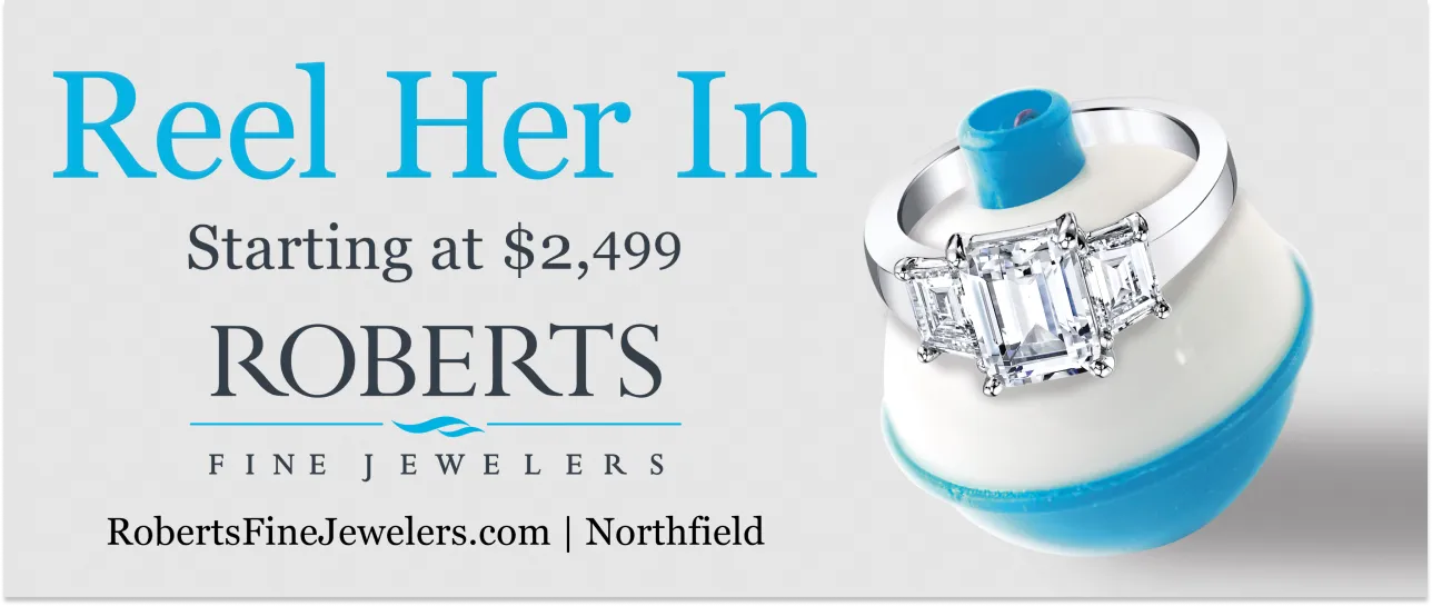
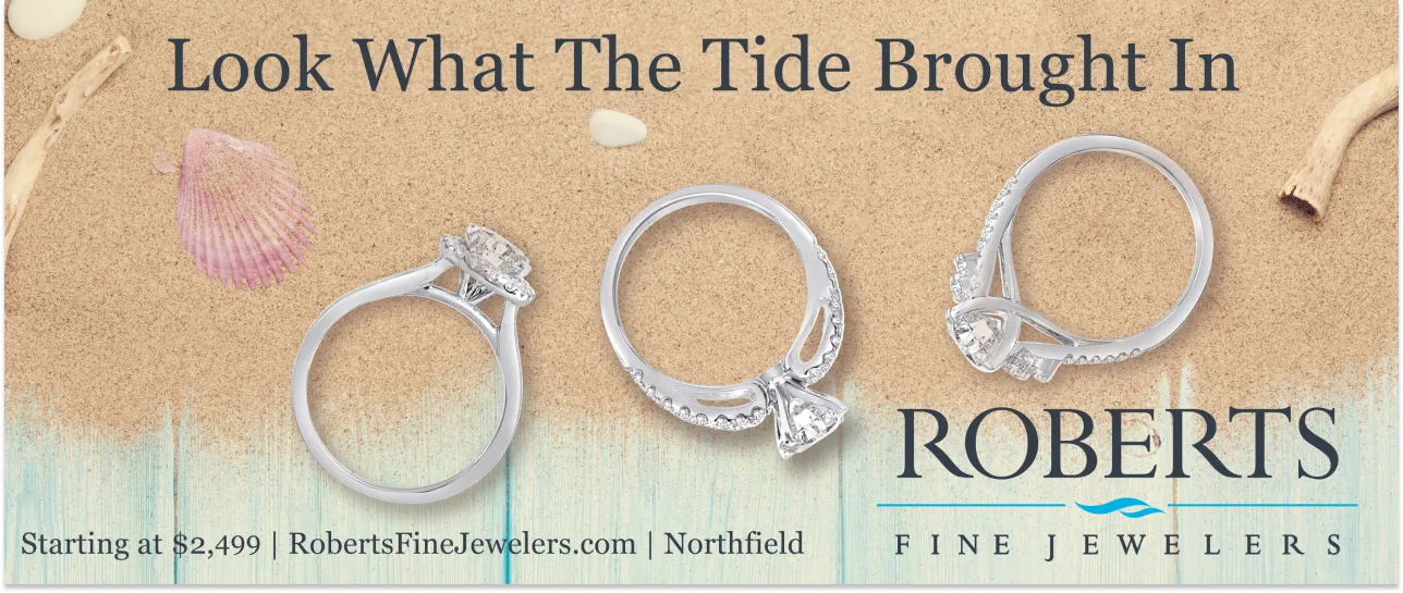
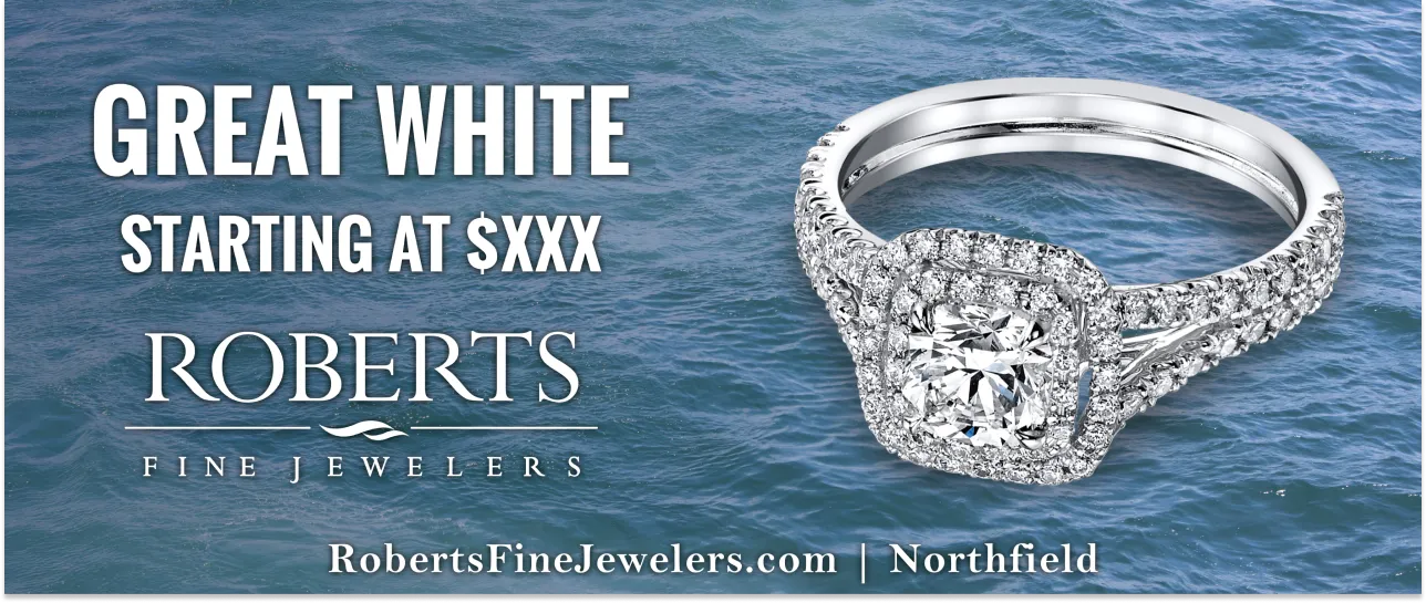
Roberts Fine Jewelry embraced its coastal New Jersey identity through playful nautical campaign themes. Using copy that had already been developed, I designed a series of billboards that balanced memorable messaging with premium engagement ring photography, helping the retailer promote its largest product category through clear, high-impact outdoor advertising.
HIGHLIGHTS
MY ROLE
Bringing the campaign to life visually.
I designed the billboard layouts, established typography and visual hierarchy, selected imagery, and prepared the artwork for large-format production. While the messaging was provided, the visual execution was my responsibility.
THE CHALLENGE
Outdoor advertising leaves very little room for error.
Drivers only have a few seconds to read a billboard. The challenge was to support the campaign's nautical wordplay while ensuring the engagement rings remained the focal point. The copy grabbed attention, but the design had to make the product memorable.

DESIGN APPROACH
Let the product and the headline work together.
Rather than competing for attention, the typography and jewelry photography were designed to support one another. Strong contrast, clear hierarchy, and generous scale helped the campaign remain readable from a distance while reinforcing Roberts' distinctive coastal brand.
OUTCOMES
A campaign built for quick recognition.
The finished billboards translated an established campaign into a cohesive outdoor advertising series that balanced brand personality with product marketing. While simple in scope, the project demonstrates an understanding of visual hierarchy, large-format design, and communicating effectively within a highly constrained medium.