
Ohio State Executive Programs Digital Viewbook
Helping prospective students compare complex educational pathways through thoughtful information architecture.


OVERVIEW
A digital resource designed to support every stage of the enrollment journey.
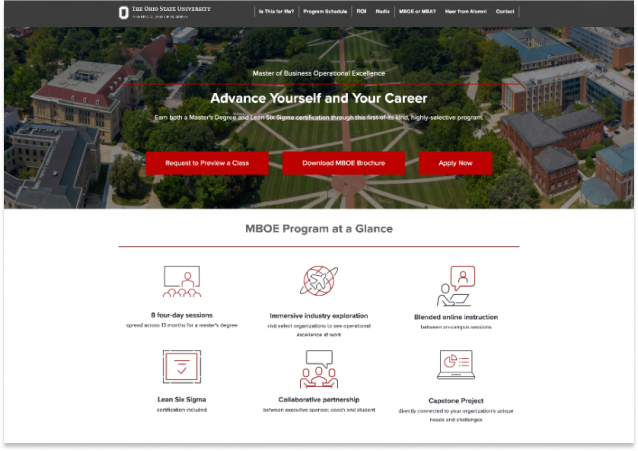
Ohio State's Fisher College of Business offers several executive education programs designed for experienced professionals, each with distinct formats, audiences, and career outcomes. Prospective students needed more than a marketing page—they needed a way to understand their options, compare programs, and determine which path best aligned with their goals.
I designed a digital viewbook that served as a central resource throughout the recruitment journey. Rather than supporting a single campaign or traffic source, the experience helped prospective students explore programs, compare key differences, and take the next step when they were ready.
HIGHLIGHTS
MY ROLE
Designing an experience that continued to evolve through user behavior.
I designed the digital experience, created comparison tools and modular content layouts, and collaborated with the broader marketing team to support multiple stages of the enrollment journey.
Following launch, I monitored engagement through analytics and heatmap data, designed reporting dashboards for quarterly business reviews, and recommended iterative improvements based on observed user behavior.
THE CHALLENGE
Help busy professionals compare complex educational options with confidence.
Unlike a traditional campaign landing page, the digital viewbook needed to support users arriving from many different entry points. Some visitors were discovering executive education for the first time, while others were already evaluating specific programs or speaking with recruiters.
The experience also served a unique audience. Working professionals evaluating graduate education often balance career goals, family commitments, financial investment, and time constraints alongside academic considerations. The challenge was creating an experience that helped users understand not only the differences between programs, but also how each option fit into their professional lives.
DESIGN DECISIONS
Structure the experience around exploration instead of linear storytelling.
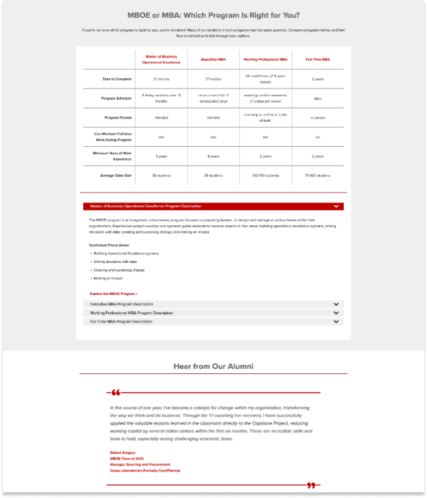
The experience was structured to support comparison rather than linear storytelling.
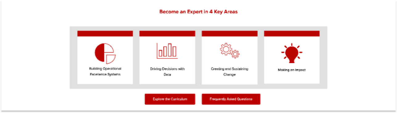
Modular content sections allowed prospective students to navigate directly to the information most relevant to them, while comparison tools helped clarify the distinctions between programs without requiring users to move between multiple pages. Throughout the experience, messaging emphasized outcomes, flexibility, and practical considerations that mattered to working professionals, including workload, scheduling, and career impact.
Because the viewbook served users at multiple stages of the decision-making process, it included a variety of calls to action rather than a single conversion goal. Visitors could request information, connect with recruiters, explore individual programs, or continue learning based on where they were in their decision journey.
OPTIMIZING AFTER LAUNCH
Behavior revealed opportunities the original design couldn't predict.
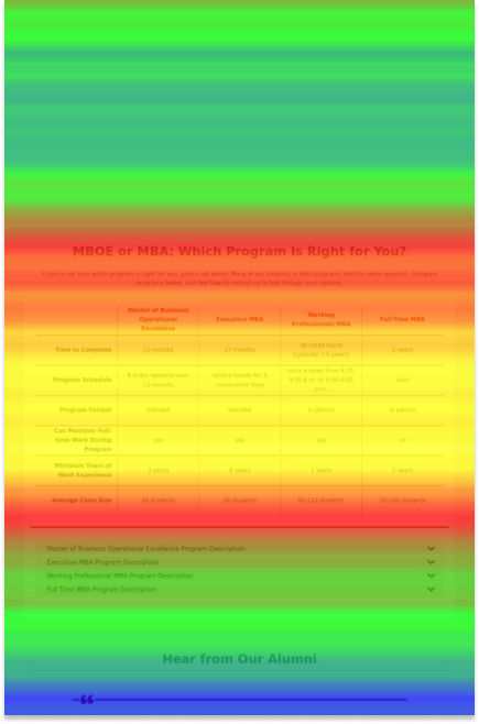
Following launch, I monitored engagement using analytics and heatmap data to better understand how prospective students interacted with the experience.
User behavior revealed opportunities to improve content hierarchy, particularly around scroll depth and module placement. Based on those insights, I reorganized sections of the page to surface higher-value content earlier in the experience, helping users encounter important information before engagement began to decline.
I also designed reporting dashboards used during quarterly business reviews, giving stakeholders a clearer view of performance and helping guide ongoing optimization discussions.
OUTCOMES
A flexible recruitment experience shaped by continuous optimization.
The final experience became a centralized resource for prospective executive education students across multiple recruitment channels.
By supporting exploration, comparison, and conversion within a single experience, the digital viewbook gave prospective students the flexibility to engage with content based on their individual needs while providing Ohio State's recruitment team with a versatile asset that could support conversations throughout the enrollment process.
Key Takeaways

Designed a digital viewbook supporting multiple executive education programs.
Created comparison tools and modular content structures for complex program information.
Designed for multiple traffic sources and stages of the recruitment journey.
Used analytics and heatmap data to identify opportunities for post-launch optimization.
Designed reporting dashboards to support quarterly client reviews and ongoing performance analysis.